Choosing the perfect paint color can transform your home’s interior, but it can also be overwhelming. If you’re considering Accessible Beige by Sherwin Williams, you’ve come to the right place. This light beige paint color is known for its versatility and warmth, making it a popular choice for homeowners. Let’s dive into the details to help you decide if it’s the right color for your space.
1. What Color is Accessible Beige?
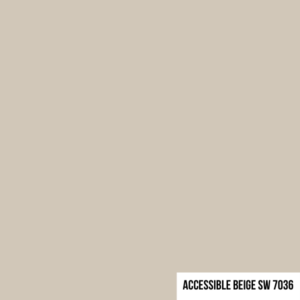
Accessible Beige is a light, neutral beige that falls on the softer side of the color spectrum. While it is officially classified as beige, it has subtle gray undertones, making it more versatile than traditional beige shades. This blend allows it to adapt beautifully in different lighting conditions, sometimes appearing slightly greige (a mix of gray and beige).
2. What Paint Colors are Similar to Accessible Beige?
If you like Accessible Beige but want alternatives, consider these similar shades:
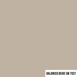
• Balanced Beige (SW 7037): Slightly darker and richer than Accessible Beige.
• Revere Pewter (Benjamin Moore): A greige option with more gray tones.
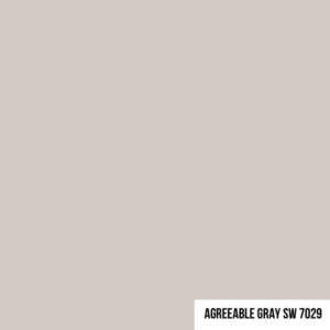
• Agreeable Gray (SW 7029): A lighter, cooler greige that’s a bestseller.
These colors have the same adaptability but vary slightly in depth or tone, making them excellent substitutes or complementary choices.
3. Is Accessible Beige Warm or Cool?
Accessible Beige is a warm paint color, thanks to its beige base. However, its gray undertones keep it from feeling overly warm or yellow. This balanced warmth creates a soft, cozy atmosphere without overwhelming your space. It works well in homes with both natural and artificial light.
4. Coordinating Colors for Accessible Beige
Accessible Beige pairs beautifully with a range of colors. Here are some top recommendations for coordinating shades:
White Dove (BM OC-17): A soft, creamy white for trim or ceilings.
• Sea Salt (SW 6204): A light, muted green that adds a refreshing contrast.

• Hale Navy (BM HC-154): A deep, bold blue for accent walls or furniture.
• Urbane Bronze (SW 7048): A rich, earthy brown for dramatic pairings.

These colors allow you to create harmonious color schemes that suit a variety of design styles.
5. What are Accessible Beige Undertones?
Accessible Beige has subtle gray and green undertones. These undertones help it appear neutral and adaptable in most spaces. Depending on the lighting, the gray can make the color appear cooler, while the green undertones may show up in low-light environments. These undertones prevent Accessible Beige from looking too stark or muddy.
6. What is the Difference Between Accessible Beige and Balanced Beige?
While both are part of Sherwin Williams’ beige family, Accessible Beige is lighter and more neutral compared to the richer, warmer tones of Balanced Beige. Accessible Beige leans slightly greige due to its gray undertones, making it a softer choice. Balanced Beige, on the other hand, feels more traditional and grounded, ideal for spaces where you want more depth.
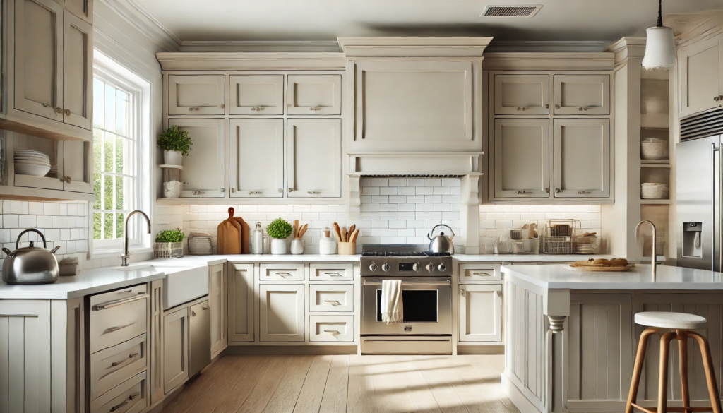
7. Accessible Beige in the Living Room
Accessible Beige is a favorite for living rooms because of its warm, welcoming vibe. It works well with natural materials like wood and stone, and it complements a variety of furniture styles, from contemporary to farmhouse. To make your living room feel cohesive, use Accessible Beige on the walls and pair it with lighter neutrals, colorful throw pillows, and textured rugs.
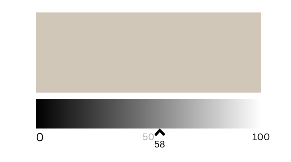
8. What is the LRV of Accessible Beige?
The Light Reflectance Value (LRV) of Accessible Beige is 58. This means it reflects a moderate amount of light, making it neither too dark nor overly bright. It’s a great choice for rooms with moderate to good natural light, as it can brighten the space without washing out.
9. What Color Cabinets Go with Accessible Beige?
Accessible Beige complements both painted and natural wood cabinets:
• White Cabinets: Crisp white cabinets create a fresh, timeless look.
• Gray Cabinets: Soft gray cabinets enhance the subtle gray undertones of Accessible Beige.
• Natural Wood Cabinets: Warm wood tones like oak or walnut bring out the warmth in the beige for a cohesive, earthy vibe.
• Black Cabinets: For a bold, modern contrast, pair Accessible Beige walls with black cabinets.
10. What’s the Difference Between Accessible Beige and Agreeable Gray?
While both colors are versatile neutrals, Accessible Beige leans warm with beige and gray undertones, while Agreeable Gray is cooler and has a stronger gray influence. If you want a slightly warmer, cozier feel, Accessible Beige is the better choice. For a more modern and gray-dominant look, go with Agreeable Gray.
Final Thoughts
Accessible Beige by Sherwin Williams is a beautiful, timeless paint color that suits a wide variety of homes and styles. Its balanced warmth, subtle undertones, and versatility make it a reliable choice for any room. Whether you’re painting a living room, kitchen, or bedroom, Accessible Beige offers the perfect backdrop for a stylish, welcoming space.